Color Analysis
Recently, I used a professional studio to do my color analysis and it was really interesting. I knew a little bit about color theory through school and art and I have seen businesses that provide this kind of service, but I finally got curious enough to see what my best colors are.
I have come across the youtube channel called Color Analysis Studio. The channel is run by Giulia and Alessandra, two Italians who live in Melbourne, Australia and do these kind of color analysis professionally. I really liked their videos and their energy, so when I realized that the color analysis can be done online, I reached out and scheduled my analysis. If anyone is curious about it, here is the link to their website: https://colouranalysis.au/ There are all the guidelines that you need, if you want to use their service, like I did. This is not sponsored, I just genuinely like them.
The idea is that we all have a particular group of colors that works best for us regarding our skin undertone, overtone and our intensity. You would call it hue and saturation. They use a series of drapes in various colors and see how your skin tone and your features react to the lights reflecting of those colors. They start with determining where you fall on the scale of warm and cool undertone. For example, my undertone is not very dominant, so I always referred to my undertone as neutral. The truth is that I lean a bit warm and that automatically puts me in one of the warm seasons: Spring or Autumn. Upon further analysis with different color intensities of warm toned colors, my predominant feature turned out to be softness and low intensity, so I am in a Autumn Soft group. They explained all of this in an extensive PDF they sent me and that contained all the information that should make my further color choices in clothes, makeup and hair color, when I dye it, much easier. I must admit I had no idea what season I would be, maybe Spring, but I am really happy with my results. I do love these muted soft warm yellows, greens and browns. I have to be more careful with my blues (green blues are the best now) and should switch pinks for more muted peaches, but it all makes sense now especially with makeup.
I have always been drawn to pink blushes and this year with the Barbie craze, I have bought a couple of really bright and cool toned pinks. It never looked great on me and I had to be careful not to over apply it, otherwise I would look like a clown. Well, it turned out I need to stick to nude, peachy and earth toned blushes as it meshes better with my skin tone. This goes also for eye shadow. I loved my Natasha Denona Glam palette since I bought it, but I haven’t used it much. The colors are beautiful and neutral, but I was never able to get an amazing look for me out of it. Well, they are too cool toned for me! That is why it always looked off on me. Same with pink eye shadows. My ideal colors are warm browns, golds, soft oranges, olives. The same goes for the lips: warm nudes, peachy nudes and caramels will not clash with my undertone and features. This way you get to see me and not the color on me. The right colors add to your features and not distract from you.
I am not going to shop now like there is no tomorrow. That is not the point. This new knowledge is helping me make better choices in the future when I go out and need to buy something. I also looked into my makeup collection and pulled out all the things that I know are not working for me. I am sad to let go some of these makeup, but ultimately they will go to friends and family and they will be used and loved by someone who will look fabulous wearing them.
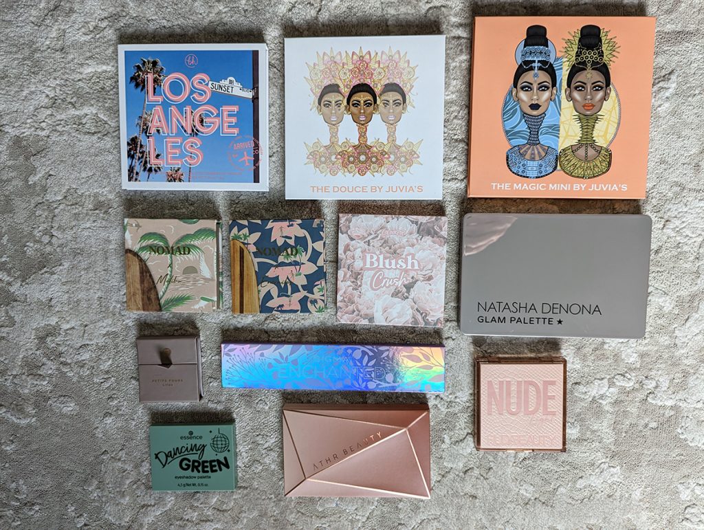
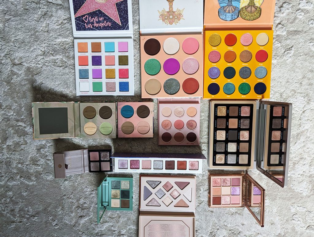
Some of these palettes have nice shades that would work for me, but I am not prone to keep the lovely The Deuce palate for those 4 corner shades, as I have them in other palette since they are more on the warm basic side. Same with Lost in Los Angeles. I won’t keep 16 eye shadow palette for those 3 shades I would wear. I love that gold and warm browns, but I have two other BH Cosmetic palettes that I am keeping that have very similar shades. I didn’t get much use of The Magic mini palette. I liked that blue purple in the third row as it is very dimensional, but now that my hair is brown (yes, I have been to the hairdresser already), it doesn’t look good. I would maybe use half of that palette for those warm tones, but the truth is some of them are just too intense for me. I liked Colorpop’s Blush crush and Huda’s Light Nude palette (which I got in Genova when traveling), but I would only use them for couple of warm peachy shades. Viseart is brand new, as is Aether beauty, but they pull so cool toned on me, that I look grey. I like two shades of Sigma Enchanted on me, but I have similar warm tones in other palettes. Nomad has a great formula, but these two color stories are too cool on me. I had high hopes of Essence Dancing green, but most of the shades pull murky on me. Could be a user error, or lower quality shadows, but I just don’t feel like I need it. It was a freebee with a purchase, so I don’t feel guilty letting it go. 12 eye shadow palettes gone! Well this will surely curb any craving for hyped up makeup, now that I know I can skip them if the color story will not work for me, like Natasha Denona’s I need a nude palette. It looks BEAUTIFUL in the photos, but I am afraid that it will look meh on me since it is on a neutral cool side. I am not sure that it has enough warmth to look nice on me. So, I will not be spending my money on that. I am eyeing Lisa Eldridge’s Cinnabar palette though, but we’ll see.
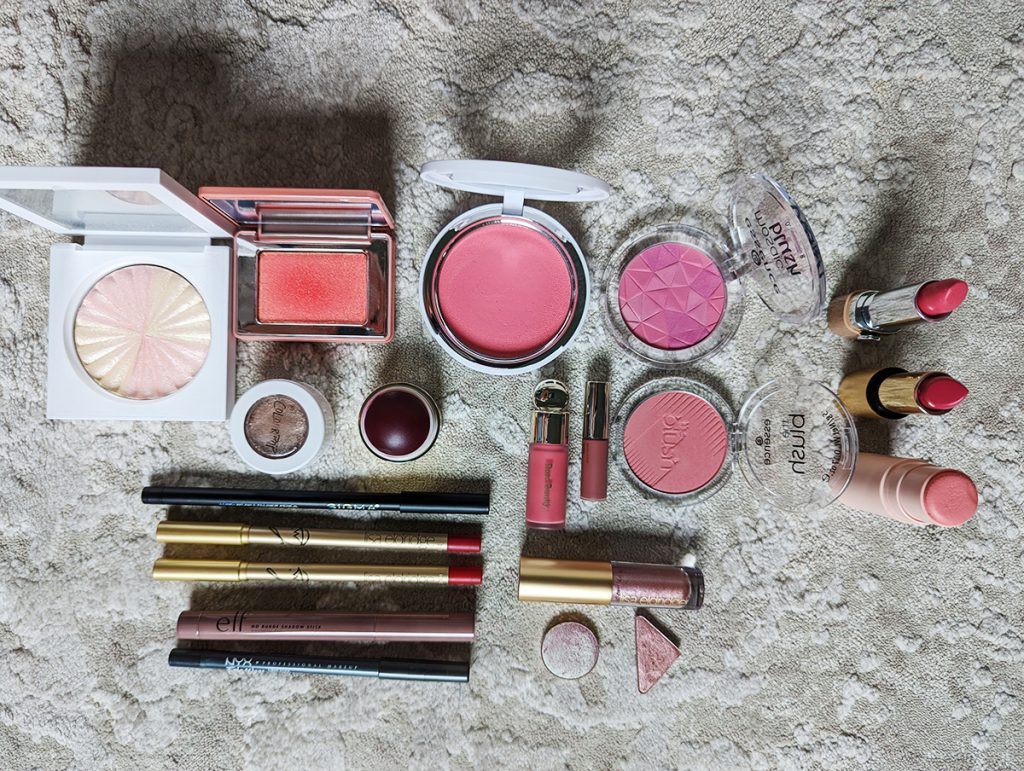
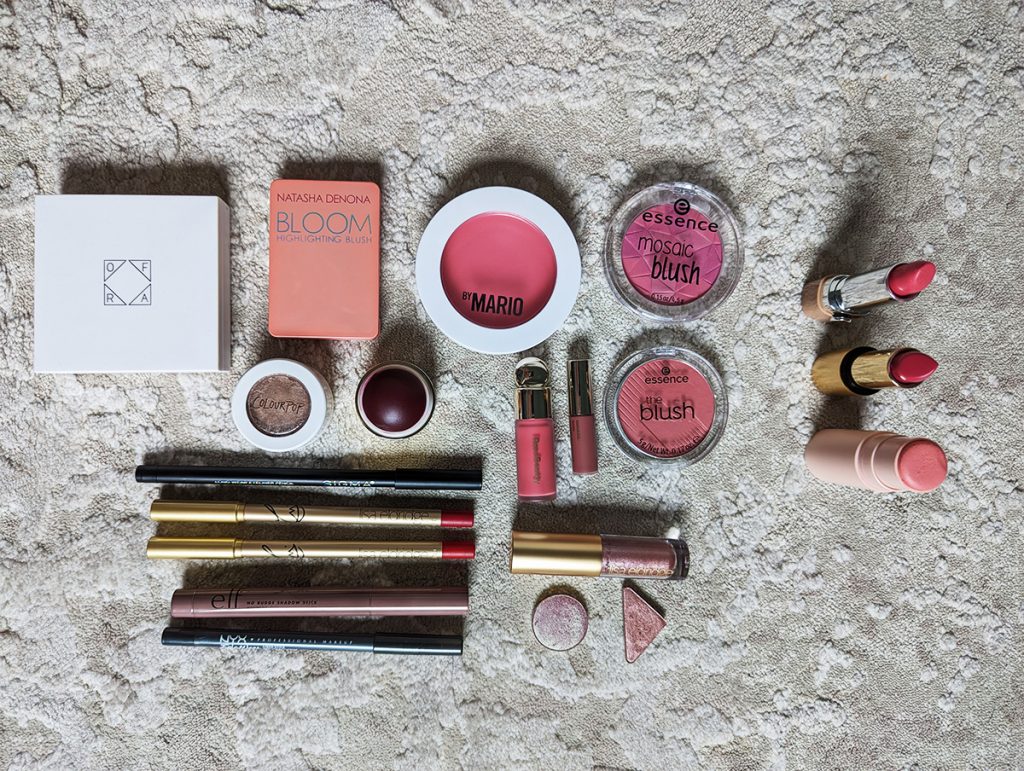
Just look at these blushes: berry, hot and baby pinks! How pretty! Yes, but not on me. I do love the formula of Makeup by Mario, but this color is so not for me. Maybe some day I get the more neutral shade, but I am OK letting these colors go. I thought about keeping that little Natasha Denona Bloom blush, but I have Nabla’s blush (shade Truth) that is almost the same in case I will wear a bright coral shade (like in the summer). Merit has a nice formula, but berry tones are not for me. Lisa Eldridge’s lip liners are going to make someone very happy. I was on the hunt for that perfect blue toned reds. I found them and they look so bad on me. I also don’t need a grey or black eyeliners. Elf eye shadow stick is of course cool toned taupe shade, as well as couple of single shadows.
I really recommend getting to know you ideal color palette. Colors can make you look more vibrant and more rested, even when you don’t wear makeup and that’s my favorite part. I am looking to downsize my makeup collection and really have only the things that work well for me and I love to use. Easier to travel with it too.
I will maybe buy one or two more things in the upcoming sales. I have also used up a lot of products this year, and with this declutter, I will have a really nice small-ish makeup collection.
I will keep you posted. Until then, as Giulia and Alessandra would say: hope you have a colorful day!
XOXO, Iva
P.S. I also sent to Color Analysis Studio Nate’s photos and he is also in Autumn season: Autumn Warm. Same color story but more intense….well, he has more intense personality then me 😉 I am just thrilled that we are the same season. I was so sure he has cool undertone, but his overtone is actually pink so that threw me off. He is such a warm guy 🙂 All these colors just mean I have more to learn, but I find this super interesting.